Verizon
Call Filter
Insights
Call protection products are inherently “set it and forget it.” While that's often a sign they're doing their job, it can also make the value they provide largely invisible to customers.
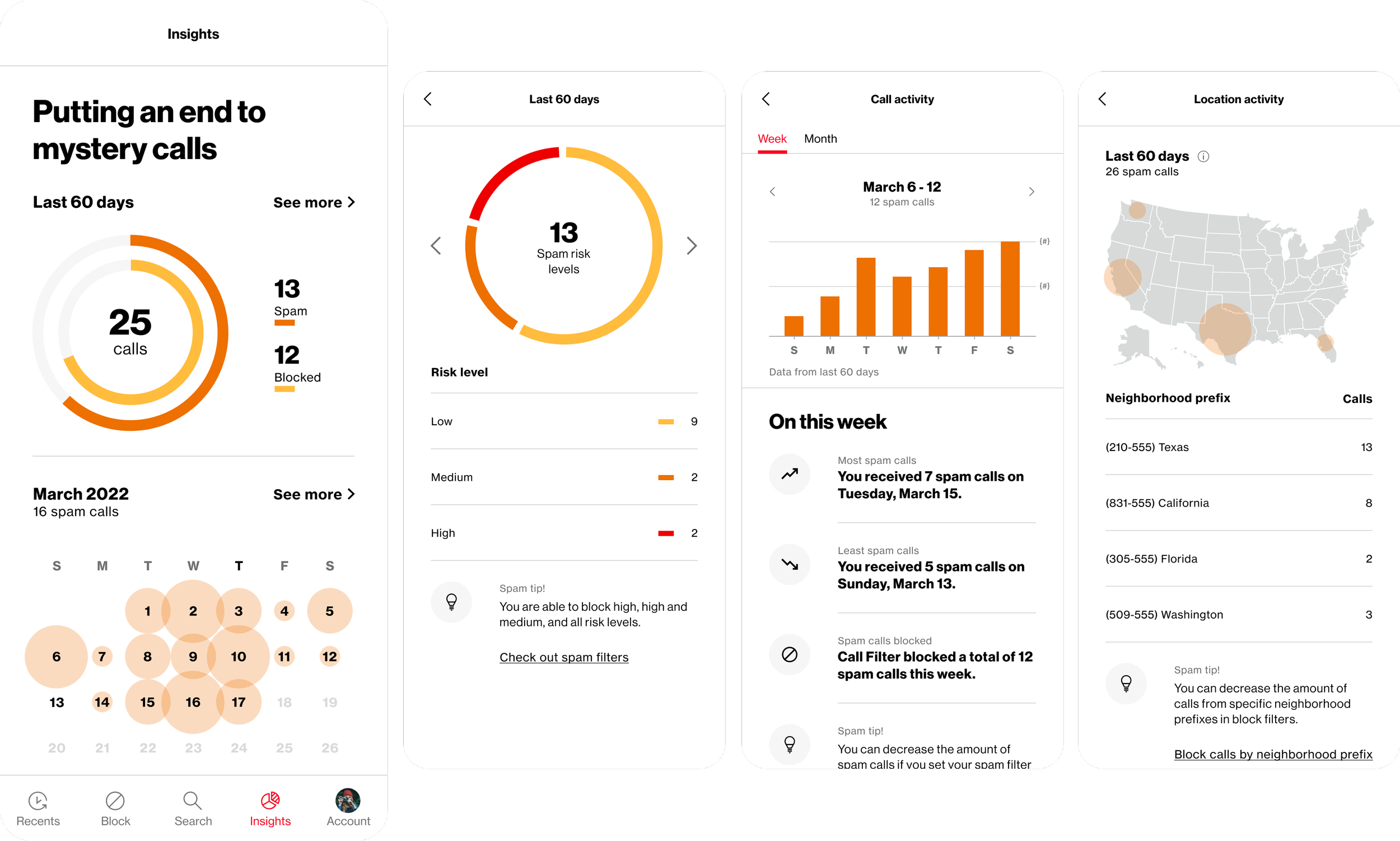
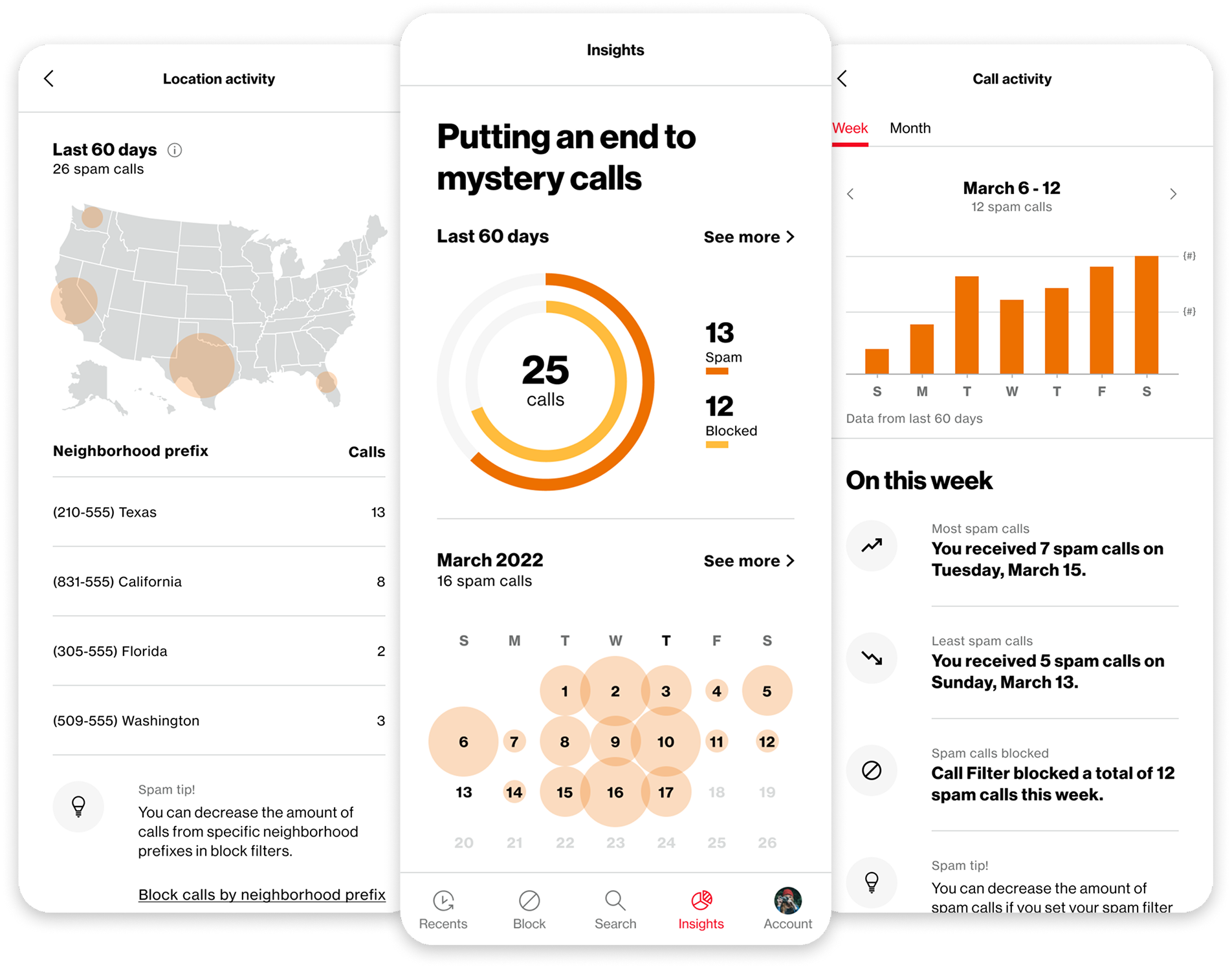
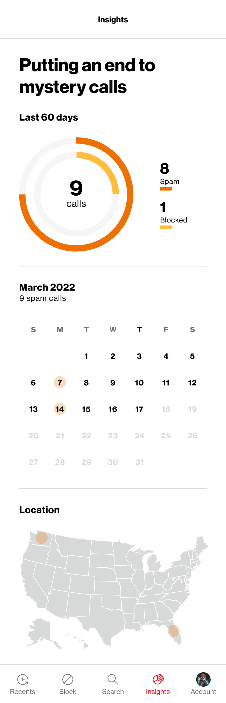
Insights was designed to make that work visible, using call and spam-protection data to show customers what Call Filter was doing for them while giving them a reason to re-engage with the product.
My design manager established the initial objective, and I led the design exploration and execution, from early concepts and data visualization through final interaction documentation.
ROLE
Product Designer
TEAM
Design Manager
Product Manager
DURATION
Spring 2022-Fall 2023
LAUNCH
Fall 2023
Challenges
Making protection visible
Determine which data best communicated what Call Filter was doing in the background without overwhelming customers.Finding Insights a home
Explore how Insights should fit into the existing product — from incorporating data into the landing experience to providing a dedicated entry point elsewhere in the app.Designing for different data states
Account for new customers with little or no collected activity, loading and empty states, and situations where a lack of data could unintentionally make the product appear inactive.Balancing Plus and Free experiences
Create a useful experience despite free customers having access to a significantly smaller data set, while still communicating the additional value available with Plus.Working within Verizon's system
Use established Verizon brand and UI patterns wherever possible rather than introducing unnecessary components that could increase design and development effort.Making data visualization accessible
Use color deliberately across increasingly complex visualizations while maintaining contrast and avoiding color as the only means of communicating information.
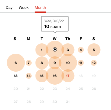
Research & inspiration
Competitor research was typically one of my first steps, but Call Filter was already ahead of the other call-protection products we reviewed in terms of design and experience. There wasn't an established model for the depth of analytics we were considering.
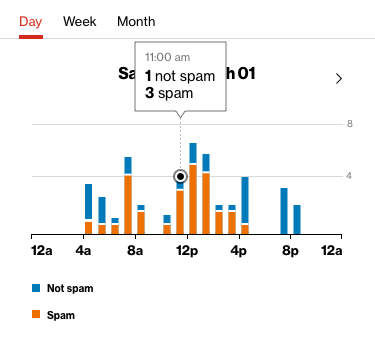
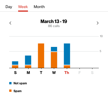
Instead, I looked beyond the category at products with more mature analytics experiences, exploring how complex activity, trends, and geographic data could be made visual and understandable. These references helped broaden the range of approaches I considered without prescribing the solution.
Exploring & validating the experience
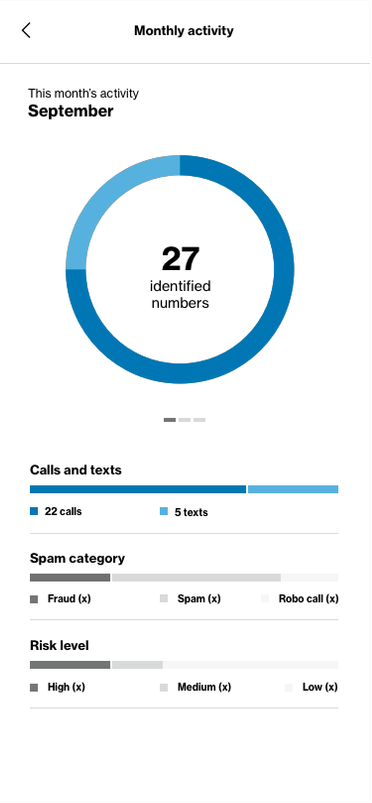
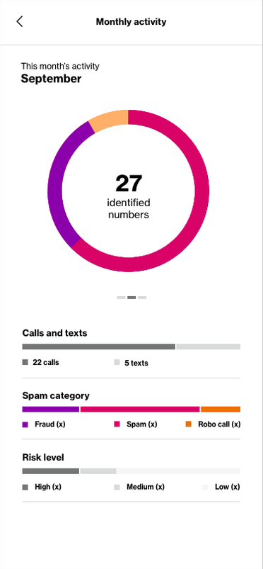
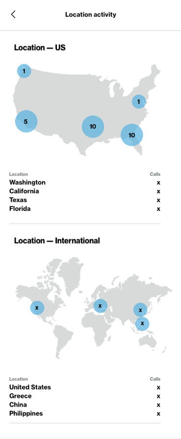
My design manager, PM and I began by identifying the types of information a Call Filter customer might actually find valuable: call activity over time, spam categories, which filters were blocking calls, spam-risk levels, and geographic origin.
From there, I explored how that information could be organized and visualized. Early concepts also considered how Insights should fit into the larger product, ranging from bringing the data directly into Call Filter's landing experience to giving it a dedicated destination in the navigation.
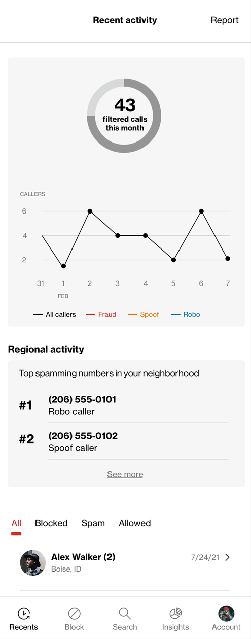
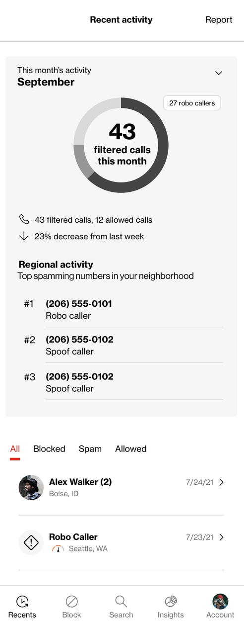
We also worked with a third party to conduct a user study on the concepts, evaluating the perceived usefulness and comprehension of the different analytics, visualizations and interactions. Our design and product team reviewed the findings together and used them as another input as the experience continued to evolve. The study itself examined everything from whether customers understood the summary visualizations to navigation between views, chart interpretation and the usefulness of different types of call activity.
As the concepts developed, ideas were added, refined or removed as we determined what was useful and feasible within the product.
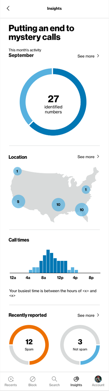
Designing across customers & data
Free and Plus customers had access to different levels of call-protection data, which meant Insights couldn't simply present the same experience to everyone.
I initially explored a more paywall-oriented approach for free customers, using a preview of Insights to demonstrate the additional value available with Plus. After feedback from Verizon, we shifted toward providing a true free version of Insights.
That created a different opportunity: the bite-sized analytics within the Last 60 Days view became contextual places to surface information available with Plus. Free customers could still use Insights, while selected breakdowns could introduce the additional data they would gain by upgrading.
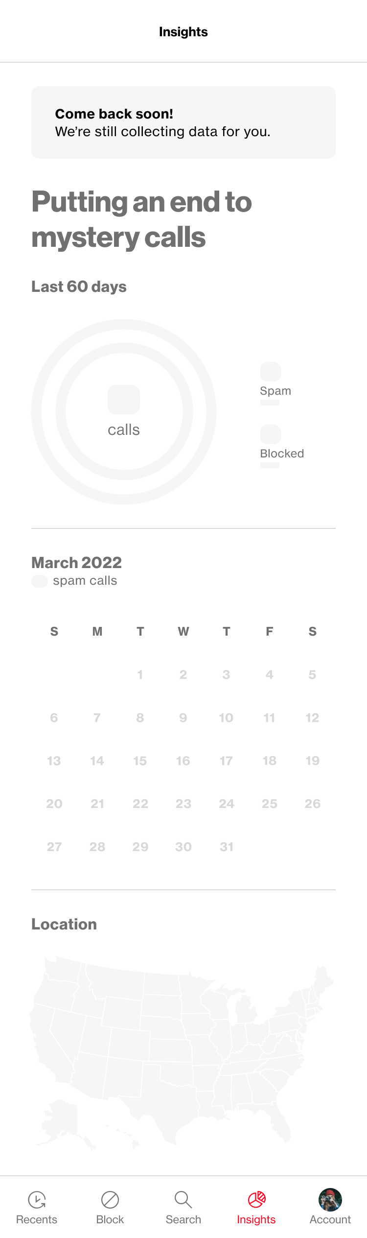
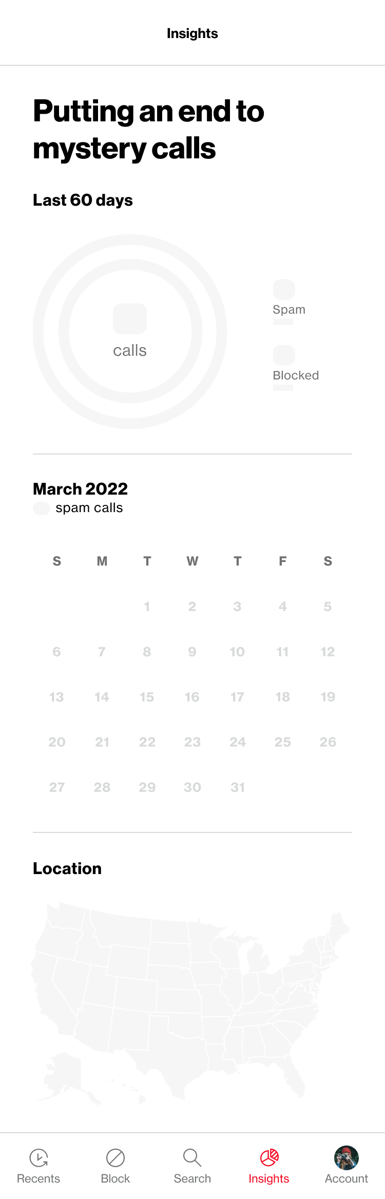
The experience also needed to account for loading and empty states and customers with little accumulated activity, so the experience remained useful across different levels of available data.
Throughout the work, I stayed within Verizon's existing brand and UI system, expanding the use of its color palette as the visualizations became more sophisticated. Color needed to distinguish data clearly while maintaining sufficient contrast and ensuring meaning wasn't communicated through color alone.
Outcome
Once the experience was finalized, detailed IXD use cases documented the interactions, states, and display logic needed by Engineering and QA for implementation.
Insights launched in Fall 2023, giving customers a way to see something that had previously happened largely in the background: the protection Call Filter was providing for them.
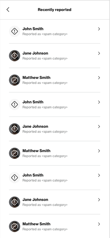
One of my earliest directions had explored bringing that thinking directly into Call Filter's landing experience rather than relying primarily on the transactional Recent Activity list. The project timeline ultimately pushed us toward a dedicated Insights destination instead.
We later had the opportunity to revisit that idea with Xfinity Call Guard, where data visualization became part of the product's primary Overview experience — carrying forward some of the thinking and visualization patterns that began with Call Filter Insights.